Your orthodontist website is more than a virtual business card. It is the face of your practice online and an opportunity to build trust with visitors and convert them into paying patients.
In this article, we’ll look at the elements to include in every orthodontic website design to ensure that you’re converting visitors into patients as efficiently as possible.
Essential Elements of Orthodontic Website Design
Professional Photography, Design & Branding
The average website visitor spends less than a minute on any given website. To get visitors to stick around long enough to schedule an appointment, you first have to capture their attention.
Original, professional photography and videos are the best way to do that, along with a strong branding message that shows visitors why they should choose you.
For example, you might start a video podcast to build trust and authority in your niche. You can also use video s to educate your audience, giving them something useful they can watch at their leisure instead of another sales pitch.
AllSmiles Orthodontics in St Petersburg, Florida, does a great job of showing off their friendly office environment right from the start, with professional video clips of their friendly staff.
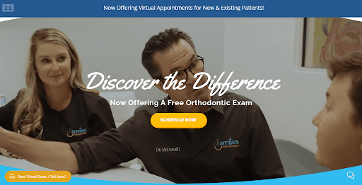
The video gives visitors a preview of what they can expect when they visit the office and makes them feel comfortable from the very first moment.
Meanwhile, Buda Orthodontics in Buda, TX, chooses to go with happy patient smiles and build their brand based on their stellar reputation—by prominently featuring local awards they’ve won in their community.
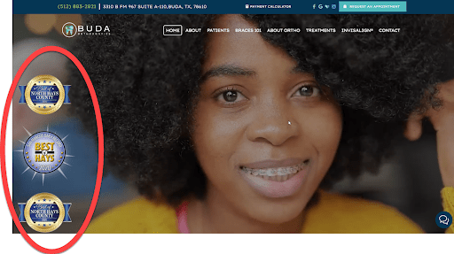
Both of these approaches work, but they represent very different brand messages.
There is no “right” message to put on all orthodontist websites.
You must understand what your practice does better than anyone else in your market. Find the thing you do BEST and build your brand around that message.
Mobile-First Design
The web is increasingly a platform for mobile devices. And that means it’s no longer enough to adapt desktop-designed websites to be mobile-friendly—you need to design your orthodontics website with the needs of mobile users as priority #1.
In 2020, 61% of website visits in the US took place on a mobile phone. That number is even higher in some industries, and it’s growing every year.
Even more, 70% of searches made on mobile phones lead to action, which means mobile visitors are highly-motivated. But if you don’t prioritize the mobile experience on your website, you risk losing them to a competitor.
So you must insist your design team makes creating a user-friendly and conversion-oriented experience for mobile users their top priority.
Search Engine Optimization (SEO)
Let’s imagine you have a great brand message, professional photography, and a killer mobile site. If nobody can find your website, none of those things matter.
That’s why your designer needs to also understand Search Engine Optimization, which is the technical process of optimizing your website to appears higher in search results. If your design/development team are also SEO experts, like HIP is, then it’ll save you time and money.
But if your orthodontist website development team lacks SEO skills, you’ll need to hire an outside consultant to optimize your pages.
Scoring one of the top 3 positions in Google searches for orthodontists in your area could generate dozens of free leads per month, so don’t invest in an orthodontics website design without SEO.
Boosting Orthodontic Website Conversions
Making your website inviting and comfortable is just step #1. Now that you’ve kept visitors on your site, you need to convert them into consultations and, eventually, patients.
Here are conversion strategies that every orthodontist must include on their website:
Calls-To-Action
Never forget to tell your website visitors what you want them to do next. Because if you don’t ask them to take action now, they’ll leave your site without doing anything. And you’ll have no way to contact them again.
Most websites should have one primary call to action button, but you may also have some secondary calls to action. These are the best calls-to-action.
orthodontists should feature on their websites, as they move your customer into the next step of your funnel:
- Book a Free Consultation
- Start a Virtual Exam
- Call Us (tap to call functionality for mobile)
On-site Chat Widget
Your potential patients want immediate answers to their questions. And offering them the option to chat with a member of your patient care team is a great way to give them answers.
But that’s not all a chat widget does…
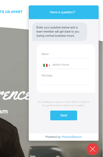
A chat widget, like the one included with HIP’s PracticeBeacon software, also lets you collect vital contact data so that you can follow up later with text messages or email campaigns. If you can get this critical data on visitors, you’re much more likely to convert them into customers by following up with them just a few times.
You don’t need to have someone manning the chat 24/7 either. Check out this message on the AllSmiles website, which lets them collect data from their leads day or night: “Enter your question below and team member will get back to you during normal business hours.”
Online Booking Portal
Your website should make it easy for potential patients to find their way to your chair. An on-site booking application is the best call-to-action for getting patients into the office.
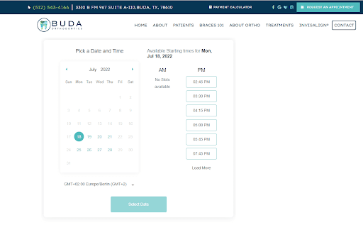
A booking application lets patients book an appointment in seconds without having making a phone call. And they can easily choose a time that aligns with their busy schedule without any back-and-forth.
If you’re not already booking appointments online, start now. And then automate follow-up via text message and email to ensure that your leads actually show up to their appointments!
Trust Elements & Testimonials
Professional photos and web design go a long way toward building trust on an orthodontist website. But you can do other simple to help visitors feel like you’re the perfect solution for their family.
Both local awards, like you saw on the Buda website above, and professional orthodontics association certifications can help build trust with your visitors. So display your badges and awards prominently and proudly—they make a difference!
Over 90% of 18-34 year-olds say they trust online reviews as much as in-person recommendations—use this credibility factor to your advantage.
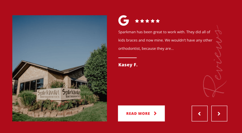
Display customer testimonials prominently throughout your website—on the homepage, especially—and consider dedicating a full page to them too. Pulling reviews from external sites, like Google reviews, can be great to establish that they’re genuine reviews made in a public forum.
Map Location & Directions
Visitors will want to know where your office is before booking an appointment. Including a map in your orthodontic web design makes it easy for potential patients to see how easy it is to arrive at your office from their home, school, or workplace.
You should link your location to Google Maps so that mobile users can simply click to open directions as they run out the door to their appointment.
Thinking of an Orthodontic Website Redesign?
If your website isn’t attracting enough organic traffic, grabbing the attention of your visitors, or driving those visitors to convert, then it’s time to rethink your design.
But before you start googling best orthodontics website designs, take some time to create a winning strategy for your website.
Start by examining each of the items on this page. Then check out the best orthodontist websites and examine them critically to see what makes them so effective.
Next, think deeply about your practice and what makes you special. What is unique about your practice that you can build a brand around? Is it friendly service, top-quality orthodontics, happy patients, or a stress-free experience? And what specific proof can you use to back up that claim?
Our Suggestion: Work with Professional Orthodontic Website Designers
Like a patient’s smile, your orthodontist website is the first thing most people will remember about your practice. But if any of the elements on this page is out of balance, you could lose dozens of patients per month without even realizing it.
That’s why it doesn’t make sense to try to do it yourself or work with a talented web designer without experience optimizing orthodontist websites for conversions.
At HIP, we’ve helped nearly 100 orthodontics practices, including some of the nation’s fastest-growing practices, achieve high-ROI, 7-figure growth year after year. And a high-converting website is a crucial piece of our successful formula.
When we worked with Dr. Jennifer Eisenhuth to redo her website, we helped her site climb the Google search rankings and convert 221% more visitors into patients. The overall impact on her business was phenomenal:
- 129% Increase in Time On Site
- 158% Increase in Page Views
- 64% Decrease in Bounce Rate
- 221% Increase in Organic Conversions (558 Compared to 171)
- 17% Increase in Revenue
Want a Custom Web Design for Your Orthodontic Practice?
If you’re ready to get more revenue from your online presence, head here to learn more about our orthodontic web design process.

