A great orthodontic website design can help you attract new patients and showcase your expertise. Meanwhile, high-quality photos of your practice, staff, and office help potential patients feel what it would be like to receive treatment from you.
You’ll also want to include detailed information about your treatments and any financing options or special offers to help convince potential patients to schedule a consultation.
Finally, including integrated appointment scheduling or virtual consults makes it convenient for potential patients to start working with your office.
Overall, a well-designed orthodontic website can help increase the visibility of your practice and make it easier for potential patients to learn about and choose your services.
FREE BOOK: Websites That Convert
The Top 15 Orthodontic Web Designs of 2025
To help you see what goes into a genuinely great orthodontic website design, let’s look at 20 of the best orthodontic websites online today to see what makes them stand out.
Elevation Orthodontics
Know Your Audience
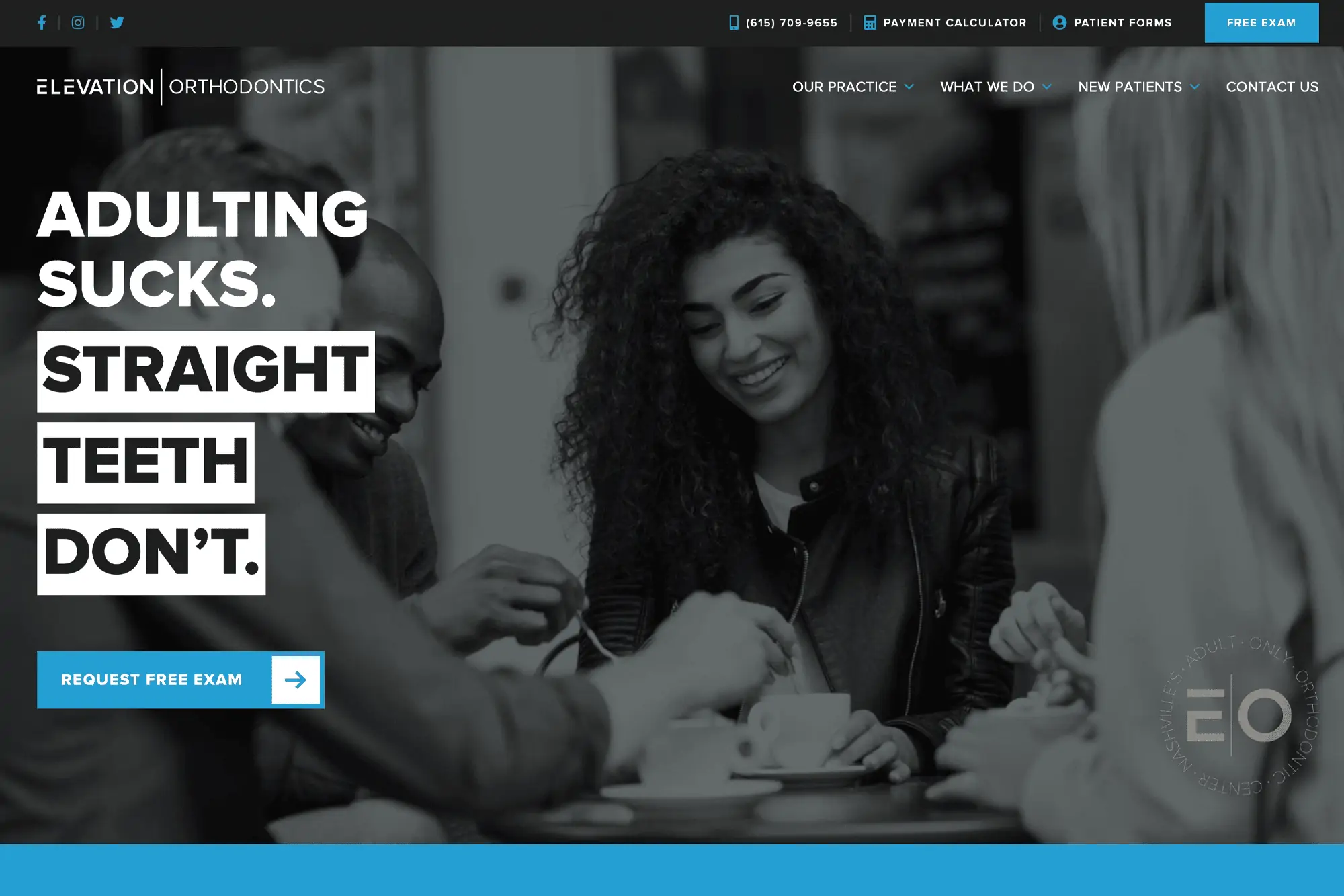
The first rule of marketing is “know your audience,” and Elevation Orthodontics hits this one out of the park!
While many orthodontists want to be everything to everyone, Elevation is highly-focused. They make it clear that they’re the go-to orthodontics practice for adults in the Nashville area. They lead with a fun adult-focused headline and follow it with consistent messaging throughout the page that doubles down on their core audience.
If you’re an adult looking for orthodontics treatment in Nashville, the hip, contemporary feel of Elevation’s website will make you feel right at home. It’s rare (and impressive) to see an orthodontist website lean this heavily into a single audience—but we applaud them for it!
Use High-Quality Photography
In addition to the copy, the photo and feel of Elevation’s orthodontic website are on-point. You won’t find awkward images of bracketed teens on this page; it’s all bright smiles and confident young adults in contemporary urban settings.
The photos establish the quality and credibility of Dr. Brice and his team to first-time visitors. It feels more like the place to be than a sterile orthodontics office. Elevation Orthodontics uses high-quality lifestyle photos to strengthen its brand!
Feature Team Profiles
Elevation creates two pages to highlight its team members—one for Dr. Brice and another for his operational team.
Your potential patients love to see your team’s faces and understand who they’ll be meeting with before they come into your office. Adding some trivia about them makes them feel more natural. It helps to make the experience personal—something that the corporate ortho chains can’t match!
FREE BOOK: Websites That Convert
Sparkman Orthodontics
BE BOLD with Calls to Action
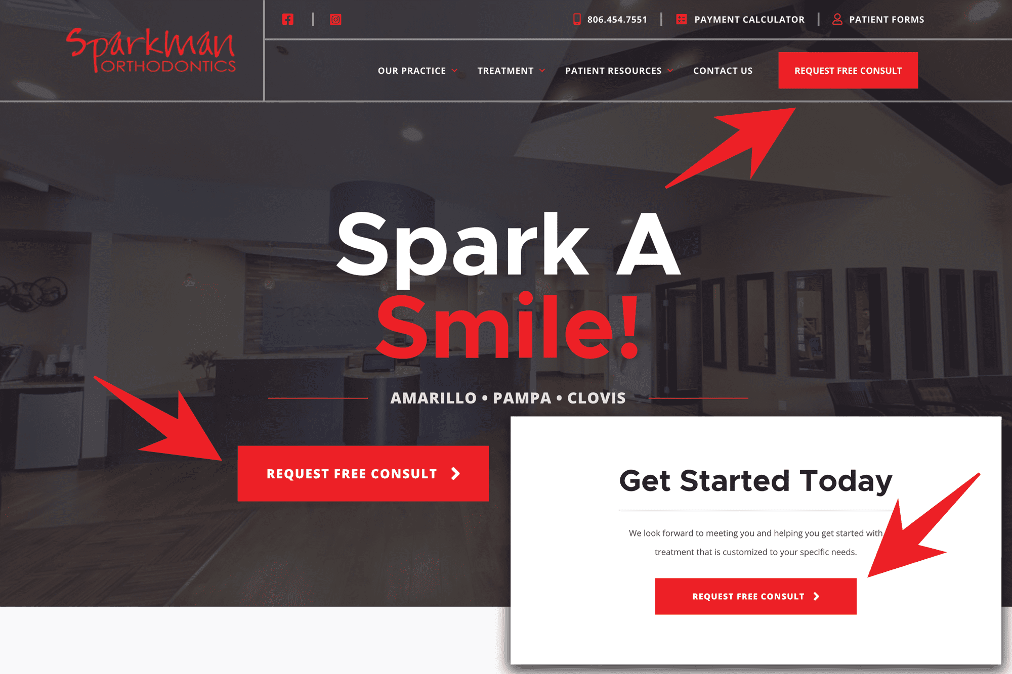
When you want someone to do something online, subtlety is highly overrated. The best orthodontics website designs incorporate strong, bold calls to action that you simply can’t miss— like the REQUEST FREE CONSULT button in the hero section of Sparkman’s website.
A large button in a boldly contrasting color draws your visitor’s attention and will increase the chances of them booking an appointment. And the focus on “free” lets them know there’s no financial obligation on their part—so why not sign up right now?
And, just in case you missed that button, Sparkman has a “sticky” red button in the right corner of their menu. Plus one more giant call to action at the bottom of the page as well, too.
Don’t let your clients wonder what they should do. Instead, include repeated bold calls to action promoting a free consultation in your orthodontic web design. It’s the easiest way to get new patients to your chair.
Show Off Your Local Awards
Do you remember that “Best of Your Local Area” award you got in your local paper? Of course, you do…but nobody else does unless you remind them of it!
Awards, especially user-voted awards, carry considerable authority in your local market and help to establish you as a leader in your region. So if you’ve been named the best orthodontist in your city or town, feature your awards on your orthodontic website!
Sparkman Orthodontics showcases 3 “Best Of” awards from their local media channels, creating immediate credibility with a huge percentage of their potential patients.
Create Location-Specific Landing Pages
If your practice has multiple offices or locations, it’s essential that your orthodontic website design doesn’t simply list the locations but also features individual pages for each office.
Why? It all comes down to Local Search Engine Optimization, otherwise known as Local SEO.
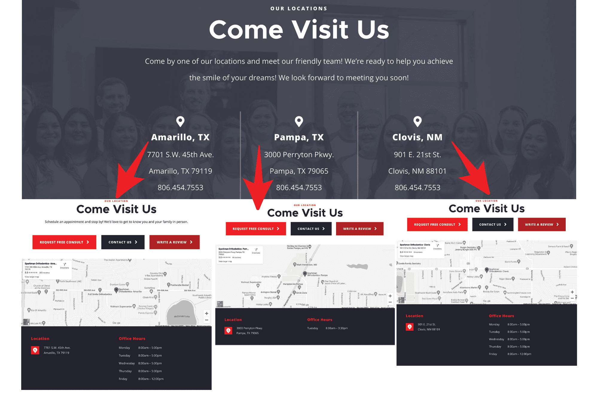
You’ll see that Sparkman lists all 3 of its locations at the bottom of its homepage. But each location is clickable, and the link takes you to a separate page featuring the individual office.
These location-specific pages on a website for orthodontists help signal to search engines that you have an office in that area. You can also use them as landing pages for paid advertising campaigns. And Sparkman’s location pages also include an embedded map to make it easy to find them—that’s a nice touch!
Potter Orthodontics
Offer On-Site Appointment Booking
According to one study, 71% of patients prefer to schedule medical appointments online versus over the phone. Based on our direct experience with our 80+ orthodontic practices, that number is even higher for orthodontists!
When searching for an orthodontist on their phone or computer, finding a time that works and booking the appointment is easy. There’s no waiting for someone to answer the phone, discussing possible times, or getting put on hold.
Create Clear Paths for Every Location
With multiple locations, Potter Orthodontics doesn’t take a one-size-fits-all approach. Their site features a dedicated Call-to-Action (CTA) Page that helps users select their closest office and instantly access that office’s scheduling system via PracticeBeacon. This not only helps with SEO by creating individual local pages—it also personalizes the experience for each patient. You don’t have to dig to find the info that’s relevant to your specific location—it’s right where you need it.
So offering an online appointment-booking app or plugin, like the one featured here on the Potter Orthodontics website, is a must for any orthodontic website design today.
PRO TIP: Want to book even more appointments? Make sure you always have consultations available the same week, even if you double-book or squeeze people in. Your visitors are likely to book a consultation with the first doctor they can find available. If you don’t have appointments until next week, you risk losing their business to a doctor across town.
Feature Strong Patient Testimonials
Did you know that 86% of patients use online reviews to choose dental services? That’s a huge deal. But when designing your orthodontic website, you get to choose which reviews they read first!
Potter uses the power of positive testimonials in two ways. First, they feature a 5-star testimonial from Google on their homepage with a slider option letting you read more.
But then they link to a separate “Reviews” page filled from top to bottom with 5-star testimonials pulled directly from Google. So don’t be afraid to overwhelm your visitors with the sheer quantity of glowing reviews you’ve received!
Senestrato Orthodontics
Feature a Google 360 Virtual Office Tour
One of the main design goals for your orthodontic website should be to prepare patients for what to expect when they step through your office doors. The more comfortable they are, the more likely they are to start treatment.
A virtual Google 360 office tour, like this one on the Senestraro Orthodontics website, helps patients know what they’ll see once they’re inside. It lets them curate their first impression of your practice.
In the case of Senestraro, the Google 360 tour makes it clear that the office is new, high-tech, and optimized for comfort. The patient reviews focus on how comfortable the doctor and team make their patients feel. The Senestraro website does a great job on many fronts, but after taking a virtual tour, who would choose any other doctor for their orthodontic treatment?
Bring Expertise to Life with a Focused Design
Potter Orthodontics understands that expertise needs to be seen and felt. The website’s design reflects this with high-quality imagery, fun graphics, confident headlines, and concise copy that builds trust without overwhelming visitors. The tone is calm, professional, and upbeat—which aligns perfectly with the practice’s reputation for comfort-driven, expert-led orthodontic care.
Mill Creek Orthodontics
Integrate Virtual Consultations
Today’s patients are impatient. And their schedules are swamped. So if you can get the ball rolling on their treatment without ever coming to your office, they’ll likely choose you over a competitor in your area.
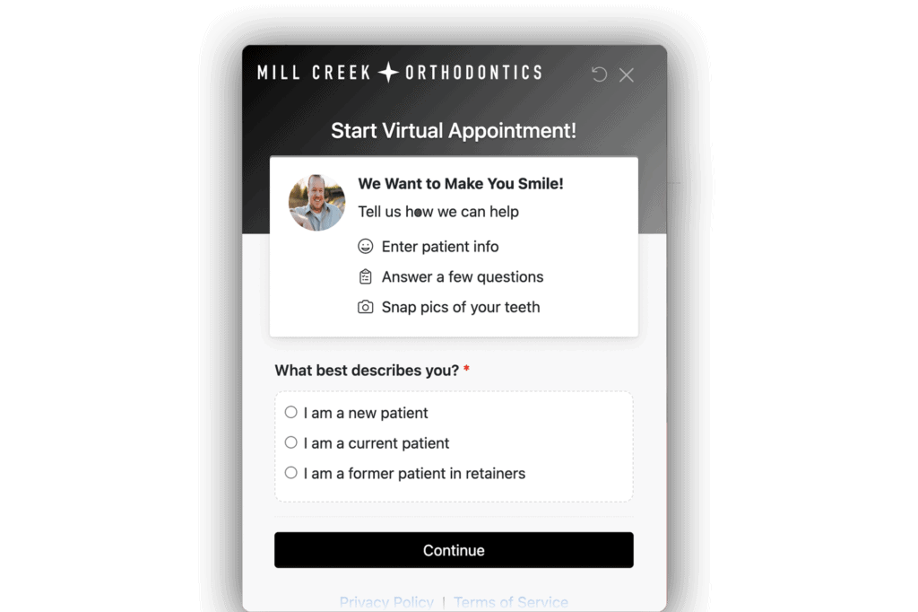
Dr. Markus of Mill Creek Orthodontics offers free “Virtual Appointments” through a website add-on powered by Smile Snap. In just a few minutes, visitors can share details and upload pictures of their teeth. Then they’ll get the results of their free virtual consultation delivered to their email inbox!
When someone is on your website, it’s often because they feel a need to do something about their smile right now. But that feeling could fade before they get around to booking a consultation. Virtual consults let you take advantage of their moment of highest interest to get the process started. And it also enables you to see more potential patients without tying up your valuable in-office appointments.
We recommend making virtual consults—with SmileSnap or a solution of your choice— a feature of your orthodontist website design.
Create a Payment Calculator
The days of waiting until the end of a one-hour in-office consultation to pull back the curtain on your pricing are over.
Patients want to know what pricing will look like before they book a consult. Besides, it’s not like the price of braces or Invisalign is a secret. There are plenty of places online to get the average cost of orthodontic treatment.
A payment calculator, like the one on Mill Creek Ortodontic’s website, can help potential patients estimate the cost of their orthodontic treatment. And it makes them more likely to follow through with their treatment plans.
What’s excellent about Mill Creek’s calculator is that visitors must register to use it. So even if they don’t schedule a consultation immediately, you can follow up with a targeted email campaign to encourage them to book a free consultation.
Include Service-Specific Landing Pages
Mill Creek features individual pages for each service category (braces, Invisalign) and age range (kids, teens, adults). This is a smart strategy for at least 2 reasons.
Firstly, these pages speak directly to the audience for each service and answer many of their questions. The page can help potential patients arrive at your office more prepared to start treatment and make your consultations run smoother and faster.
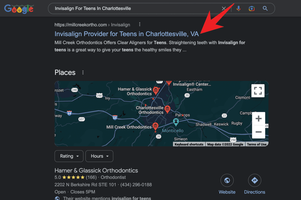
Secondly, service-specific pages help your site appear in more searches in your local area. For instance, Mill Creek ranks #1 on Google for the terms “Braces for Teens in Charlottesville” and “Invisalign for Teens in Charlottesville.”
While they may not be high volume search terms, they attract highly-targeted traffic. So owning the organic traffic for these terms could easily bring in a few more consultations each week, which adds up quickly!
Garlock Orthodontics
Bring Your Smile!
Your headline is the most-read piece of copy on your website, so it’s vital to make an impact quickly. Research shows that the human attention span has dropped to just 8 seconds (lower than goldfish, by the way) over the past few decades. So you need to tell them why they should stick around…quickly!
One great way to do that is to lead with a smile, literally. Headlines that feature the word “smile” remind your visitors why they’re here. And it gets them excited to make their dream smile come to life.
When designing your orthodontic website, be sure to lead with a headline that’s on-brand and on-topic. Actually, all 5 of the websites we’ve reviewed here do a great job with their headlines, or they probably wouldn’t make the list—that first impression is too important to overlook.
Give Visitors A Roadmap
We’ve talked again and again about how your orthodontic website design should help prepare your visitors for what to expect when visiting your office. A roadmap makes it clear that starting treatment is easy.
Of course, you want to make it sound easy, too. Nobody wants to set off on a long and painful journey, so make them see how close their dream of a perfect smile actually is.
The 3-point roadmap that Garlock uses is nearly perfect. First, they lead off with a subheadline of “Upgrading Your Smile Is Easy,” and then they lay out three easy steps to get started. In the process, they focus on low-friction language, like easy, free, low monthly payment, and relax.
They make starting orthodontic treatment sound as easy as signing up for Netflix! And with their smiling team accompanying you at each step of the design, you feel like you’ll be in good hands.
Scissortail Orthodontics
Lead With Innovation, Not Intimidation
Scissortail Orthodontics sets the tone for a digital-first, patient-friendly experience the moment you land on their website. The star feature? FlightPath™—an interactive virtual consultation tool that helps prospective patients visualize what their smile transformation could look like before even walking into the office. It’s sleek, futuristic, and perfectly in line with the expectations of modern orthodontic consumers who want convenience and clarity upfront.
Turn a Blog Into a Community Engine
Rather than a static “About Us” page, Scissortail builds its community presence through a blog-style Community Page that acts like a running archive of local events, updates, and educational posts. It gives the website a pulse—an evolving story that keeps parents, teens, and potential patients engaged long after their first visit. This type of ongoing content also doubles as a smart SEO strategy to boost traffic over time.
Keep Conversions Alive with Smart Post-Form Funnels
Where most practices stop at a generic “thank you” after someone submits a form, Scissortail pushes forward. Their Thank You Page is optimized with a built-in scheduler, allowing visitors to instantly lock in their consultation while they’re still in the “yes” mindset. It’s a subtle but powerful move that helps reduce falloff from form submissions and speeds up the path to treatment.
Clarity + Credibility = Confidence
Throughout the site, Scissortail uses clean layouts, approachable language, and strong visuals that reflect a fun, yet professional brand. The emphasis is on making orthodontics feel less clinical and more transformational. Their team bios and technology pages help drive home that this is not just a smile factory—it’s a place where care meets customization.
The Result? A Digital Experience That Feels Personal
From FlightPath™ to their community blog to seamless scheduling, Scissortail’s site shows what it looks like when innovation meets intention. It gives patients not just tools, but confidence—and that’s what truly drives conversion.
Smile Orthodontics by Dr. Sarah
Build Connection Through Visual Storytelling
The moment you land on the Smile by Dr. Sarah website, it feels personal—and that’s exactly the point. The design leans heavily on authentic imagery and soft, natural colors that mirror the calming tone of her East Hampton and Southampton practices. Instead of stock photos, you’ll find real team interactions and patient smiles that reflect the warmth of the office. It’s a powerful way to build trust at a glance—before visitors ever read a word.
Lead With Compassion, Then Convert
Smile by Dr. Sarah’s messaging is soft but intentional. Headlines emphasize care, connection, and customization rather than price or pressure. It’s a subtle but strategic approach that resonates especially with families and adult patients who are looking for a more personal touch. But make no mistake—this site is still optimized to convert. Every page includes bold, simple call-to-action buttons like “Schedule Your Free Consult,” strategically placed to guide the visitor forward.
Use Community Involvement to Humanize the Brand
What makes this practice stand out even further is its visible investment in the community. The Community Page is more than a feel-good gesture—it’s a curated collection of local sponsorships, school visits, and charitable initiatives, complete with photos and stories. It lets visitors see exactly how the practice gives back, which builds emotional resonance and long-term loyalty.
Offer Modern Tools for Modern Patients
Today’s patients expect digital convenience, and Smile by Dr. Sarah delivers with online scheduling, virtual consults, and clear contact options. These tools are seamlessly integrated and work beautifully on mobile—critical for reaching busy parents and on-the-go adults. The virtual consult offering is particularly well-positioned to engage first-time visitors who may not be ready to book in person.
Professional Meets Approachable
Everything about this site is designed to put the visitor at ease. From Dr. Sarah’s friendly bio to the calming color palette to the inviting service descriptions, it’s all a digital extension of her brand—trustworthy, smart, and deeply personal.
Dr. Bita Orthodontics
Modern Care Meets Community Trust
Dr. Bita Orthodontics, with locations in Encino and Porter Ranch, leads with a message of elegance and efficiency. From the first click, the website communicates that this is a modern, patient-first practice that respects your time and delivers outstanding results. But unlike many “luxury” brands that can feel cold or distant, Dr. Bita’s website maintains an approachable, community-rooted tone that resonates with local families.
Build Confidence with a Virtual Office Tour
One of the most effective tools on the site is the Office Tour page. Featuring real photography of the space—not just generic room shots—the tour offers a clean, professional view of where patients will be spending their time. It creates familiarity and trust, especially for anxious first-time visitors, and reinforces the feeling that Dr. Bita’s office is both cutting-edge and comfortable.
Leverage Smart Scheduling Tools
The practice’s digital strategy doesn’t stop at design—it’s built to streamline conversion. Their Thank You Page includes a smart integration with Ortho2, making it easy for new leads to take immediate action and book an appointment. By embedding this next step right after form submission, they avoid the all-too-common drop-off that happens when potential patients “mean to book later” and never do.
Stand Out with Streamlined Patient Resources
Transparency is another win on this site. A comprehensive Patient Resources section includes everything from insurance information to payment plans to what to expect during treatment. It’s designed to reduce call volume and give prospective patients a feeling of control and confidence. Bonus: the copy is actually written in patient-friendly language—no jargon, no fluff.
Marry Local Brand and Digital Power
While the website includes all the functional elements you’d expect—scheduling tools, service breakdowns, doctor bios—it’s the tone that stands out. Every page reflects Dr. Bita’s local reputation for compassionate care. Patient testimonials, real community involvement, and her warm leadership presence all combine to create something rare: a website that feels as human as it is high-tech.
Hulme Orthodontics
Simplify the Patient Journey with Visual Clarity
Hulme Orthodontics, with multiple locations across San Antonio, TX, understands the power of clear communication—and it shows throughout their website. One of the first things visitors notice is the “Practice Highlights” section built with clean, modern icons. This visual storytelling tool instantly communicates what makes the practice special: advanced technology, flexible payment options, multiple locations, and family-focused care. In less than ten seconds, a visitor knows exactly what Hulme stands for and how they’re different.
Anchor Trust with Technology
The practice does an excellent job of reinforcing their authority by showcasing the in-house tools that enhance patient care. Their Our Technology page walks patients through the benefits of in-house 3D printing, which allows for the creation of custom appliances on demand. It’s not just a cool feature—it’s a real value-add for patients looking to save time and avoid delays. For parents comparing practices, this kind of content is a game-changer.
Highlight Convenience Across Locations
Hulme’s website also makes it incredibly easy for patients to navigate between multiple office locations. The top navigation clearly lists each city, and each location page includes specific contact information, photos, and appointment booking options. This location-specific structure is smart for both SEO and user experience—it increases search visibility while reducing friction for the patient.
Design That Reflects the Brand
The design language used across the site reinforces Hulme’s position as a high-tech, family-friendly practice. The colors are clean and bright, the fonts are modern but readable, and the overall layout flows smoothly—especially on mobile. This matters, because over 70% of orthodontic website traffic now comes from smartphones. Hulme doesn’t just look good on mobile—it’s built for it.
Use Structure to Drive Decisions
By combining strong visuals, modern technology, and a commitment to convenience, Hulme Orthodontics turns a traditional practice website into a conversion-focused patient experience. Every piece of content serves a purpose, and every page leads naturally to a call-to-action. It’s design with intention—and that’s what wins.
Vibrant Orthodontics
A Brand That Lives Up to Its Name
Vibrant Orthodontics doesn’t just describe their name—it embodies it through bold colors, energetic design, and engaging calls to action across the entire site. From the very first scroll, the website communicates enthusiasm, warmth, and a high level of polish that immediately earns trust. The vibe is confident and modern, making it especially appealing to image-conscious teens and adults who want to feel great about where they’re getting their orthodontic care.
Guide Users with a Conversion-First Design
Where this site really shines is its Call-to-Action (CTA) Page. Using embedded scheduler tools, the CTA page transforms interest into action by removing all the guesswork. Visitors can choose their location, select a time, and book their consultation without ever picking up the phone. There’s no “next step confusion” here—just a clear path to getting started. And with multiple access points to this page, it’s impossible to miss.
Keep Patients Engaged with a Clean UI
Everything about the design of Vibrant Orthodontics’ site is built to encourage movement—scrolling, clicking, booking. The homepage features big, friendly headlines and compelling subcopy that makes the user feel seen and understood. Instead of dumping a wall of text on the visitor, the site guides them through the experience visually. It’s clear, welcoming, and engaging without ever being overwhelming.
Cater to Convenience-Oriented Patients
Today’s patients want fast, intuitive access to the care they need. Vibrant’s website delivers this through mobile optimization, embedded scheduling, and clean navigation that keeps things simple. It’s ideal for the digital-first families who are comparing options on the go—and often making decisions in minutes.
Create Trust Through Brand Consistency
From the homepage to the Thank You Page, every element of this site reinforces Vibrant’s brand voice: fresh, energetic, and uplifting. It’s a full-circle experience that makes you feel like the practice knows exactly who it is—and how it can help you feel confident about your smile.
Team Orthodontics
From First Visit to Forever Smiles
Team Orthodontics positions itself as a practice that supports the patient journey from the very beginning—and keeps the relationship strong long after treatment is over. Their website is designed to reflect that full-lifecycle care, with standout features like their Retainer Program Page, which is dedicated to explaining how patients can protect their smile investment over time. It’s a smart strategic move, both for building trust and increasing retention.
Offer Effortless Booking with Embedded Scheduling
One of the most frictionless elements of the Team Orthodontics site is its use of a custom Greyfinch scheduling embed. Instead of sending patients off-site or forcing them to call, the embedded form keeps everything in one place—smooth, fast, and user-friendly. Visitors can book a consultation while they’re still in that high-interest decision window, which increases follow-through and cuts down on no-shows.
Showcase Your Staff Like a True Team
True to their name, Team Orthodontics makes it a point to highlight their staff as the backbone of the patient experience. Their team pages are clean, accessible, and include names, titles, and photos that create a sense of familiarity. By doing this, the practice helps remove one of the biggest barriers to new patient conversions—fear of the unknown.
Give Long-Term Care the Spotlight
Too many orthodontic websites focus only on the start of treatment. Team Orthodontics takes a smarter approach by making long-term care—like retainers and post-treatment check-ins—a featured part of their messaging. Their Retainer Program Page doesn’t just explain what’s included—it educates patients on why retention is essential, positioning the practice as a true partner in their lifelong smile journey.
Wrap It All in a Sharp, Patient-Friendly Design
The look and feel of the Team Orthodontics website are as polished as their approach to care. It’s fast, mobile-friendly, and filled with calls-to-action that never feel forced. Their tone is clear and confident, and the site’s structure gives visitors a sense that they’re in capable, caring hands—from consult to completion and beyond.
Beverly Hills Orthodontics
Where Luxury Meets Accessibility
Beverly Hills Orthodontics sets the gold standard for how a premium brand can maintain accessibility and warmth. The moment you land on their site, you’re greeted with elegant design, polished visuals, and a crisp user interface that feels unmistakably high-end—but never intimidating. This balance is the secret behind their wide appeal: luxury-level presentation with a family-friendly, confidence-boosting vibe.
Build Authority With Consistent, Valuable Content
Unlike most practice sites that neglect content after launch, Beverly Hills Orthodontics keeps their audience engaged through a well-maintained blog. This section features thought leadership on orthodontic trends, patient FAQs, and behind-the-scenes looks at the practice—all of which reinforce their authority and help improve SEO. It’s not just fluff—it’s content that adds value for visitors and helps convert curious browsers into loyal patients.
Offer Products Patients Want
The practice goes a step beyond care by offering a curated selection of orthodontic products through their Shop section. From whitening kits to aligner-friendly accessories, this e-commerce integration reinforces their premium positioning and gives patients everything they need to maintain their smile—without having to leave the site. It’s a great example of how to extend the patient relationship beyond appointments.
Streamline Booking Without Losing the Brand Feel
Despite the luxury feel, Beverly Hills Orthodontics never sacrifices usability. The site includes clear calls-to-action on every page, guiding patients toward consultations with minimal friction. Whether it’s scheduling a virtual consult or exploring treatment options, users are always just a click away from the next step—and every interaction feels like part of the brand experience.
Design That Reflects the Patient They Serve
This site knows its audience. The color palette, typography, and photography all speak to image-conscious patients—particularly adults and teens—who care about aesthetics and value. But what sets the brand apart is how they communicate that care is not only about looks—it’s about confidence, professionalism, and personalized treatment.
Otto Orthodontics
Turn Your Website Into an Experience, Not Just a Tool
Otto Orthodontics delivers a patient experience that begins before someone ever steps into the office. Their website is modern, sleek, and built with intuitive navigation that mirrors the welcoming, professional tone they’re known for in person. But what truly sets it apart is how the digital journey feels like a seamless extension of the in-office brand—inviting, polished, and deeply patient-centered.
Add Value With a Functional Product Shop
The standout feature of the Otto Orthodontics website is its integrated Shop, where patients can purchase practical, high-quality orthodontic products. From oral care kits to branded gear and aligner accessories, this feature turns the site into more than just an information hub—it becomes a helpful companion throughout the treatment journey. The shop isn’t just a revenue generator—it’s a retention tool that adds real value for current patients.
Guide Visitors With Clean, Intuitive Navigation
From the moment visitors land on the homepage, the path forward is obvious. Otto’s website architecture is clear and effective, with logical menu groupings and well-placed calls-to-action that guide users toward key pages like scheduling, treatment options, or patient forms. It’s frictionless—exactly what busy parents and professionals want.
Visuals That Reflect Quality and Confidence
Otto Orthodontics is known for creating stunning smiles, and their digital branding reflects that aesthetic. Professional photography, bright but calming colors, and refined typography all work together to position the practice as both credible and current. This is a place where patients can expect results—and the visuals help tell that story without needing words.
Serve the Modern Patient With Digital Flexibility
With mobile responsiveness, fast load times, and embedded scheduling tools, Otto’s website meets patients where they are—on their phones, browsing between meetings, or multitasking at home. It respects the reality of today’s orthodontic consumer and delivers on their expectations for speed, simplicity, and control.
Lucas Orthodontics
Give Patients Control from the Start
Lucas Orthodontics understands that today’s patients want to manage their orthodontic journey on their terms—and their website is built to support that. From the first click, visitors are greeted with a smooth, mobile-friendly experience that puts everything they need right at their fingertips. Whether it’s booking, paying, or completing paperwork, Lucas makes it simple.
Use Digital Forms to Streamline the Process
One of the standout features is the integration of Gaidge-powered digital patient forms. These allow new patients to complete their intake paperwork online before their appointment, which not only saves time but also sets a modern tone for the entire care experience. It’s efficient for the office—and a relief for busy families trying to juggle appointments between school and work.
Simplify Payments Without Sacrificing Security
The website also includes a clear and accessible Make a Payment button. This small but mighty feature shows that Lucas Orthodontics is serious about convenience and transparency. Instead of making patients call the front desk or search through emails, the payment portal is just a click away. It’s a trust-building detail that speaks volumes about the practice’s commitment to service.
Design That Builds Confidence
The site’s clean layout, professional photos, and clear calls-to-action make it feel approachable yet authoritative. Visitors aren’t bombarded with information—instead, they’re gently guided through a digital experience that feels well-paced and genuinely helpful. Whether you’re a nervous parent or a tech-savvy teen, the site meets you where you are.
Digital Simplicity That Reflects Real-World Excellence
Lucas Orthodontics has translated their in-office professionalism into a digital experience that’s efficient, calming, and conversion-focused. It’s a modern orthodontic website that does exactly what it should: help patients take the next step with total confidence.
Best Website Designs For Orthodontics Key Takeaway
We’ll close this review of the best orthodontic web design ideas with a less-sexy but crucial aspect of your website design—the organization and structure.
A clean and well-structured sitemap and navigation menu make it easier for your visitors and Google’s search crawlers to find their way around the site.
You’ll see that Garlock organizes all their pages into four simple navigation links in the header. These are Our Practice, Orthodontics, Patient Resources, and Contact Us.
Within each menu, they organize their subfolders, so all of the “braces” pages are grouped together, all of the Invisalign pages are grouped together, and so on. This structure ensures that a developer can easily find their way around the back end of your site. And the menu structure ensures each page contains a link from the homepage, which helps Google’s search bots find the pages easily.
Overall, a well-planned and executed sitemap will make your orthodontic website easier to maintain and update. And it ensures that your visitors and the search engines will find the information they’re looking for.
Want to Guarantee A Winning Orthodontic Website Design?
At HIP, we’ve built high-converting websites for some of the fastest-growing orthodontics practices in the country. We can help you create a website that wins consults and starts more patients by incorporating all of the elements we discussed above.
What’s better? Your optimized orthodontic website makeover is included when you sign up for our Patient Acquisition and Retention Framework (PARF®).
We’ve used PARF® to create over $100M+ of added production for over 80+ orthodontics practices coast to coast, like Fishbein Orthodontics, Dr. Jennifer Orthodontics, Wentz Orthodontics, and dozens more.
Whether you’re a startup or an established practice, our proven marketing, software, and training modules can help you start more patients every month while creating an average of 400% return on investment.
Ready to grow the practice of your dreams? Schedule your free growth session now!

